Create a Pie Chart
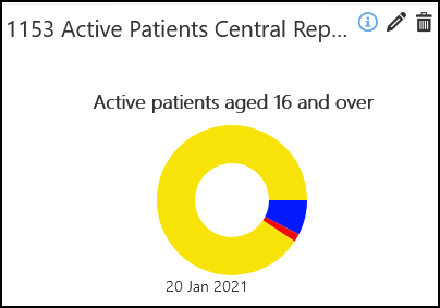
Pie Charts display data as a percentage of a Primary Indicator. For example, if you were wanting to report on the SMS Consent status for patients aged 16 or over, the Primary Indicator would be all active patients over 16, then you can see what percentage of these have a SMS Consent status.
To create a Pie Chart:
- From the Widget Gallery on the left, select Add next to the Pie Chart Widget
 or select the Widget and drag to the Dashboard.
- Optionally, drag the Widget to reposition.
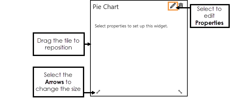
- Select Edit Widget to configure the Properties.
The Chart Properties display.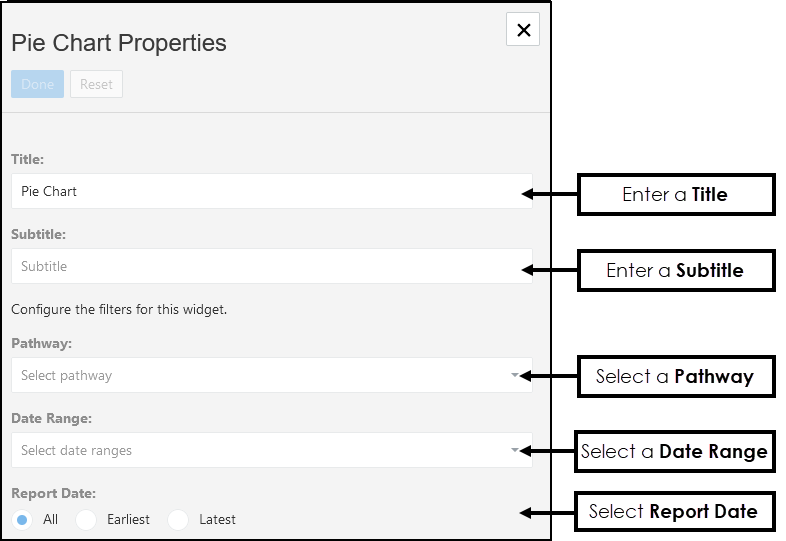
-
Enter a Title, if left blank this defaults to the name of the Pathway selected.
-
Optionally, enter a Subtitle.
-
From the drop-down list choose the Pathway you want to view data from.
- Optionally, from the drop-down list choose a Date Range, and/or select a Report Date. Note - The Date Ranges must be pre-set. See - Date Ranges.
-
Next, select the Primary Indicator, this Indicator is your target group of patients.
For example, if you were wanting to report on SMS Consent status for patients aged 16 or over, the Primary Indicator would be all active patients aged 16 and over, then you can see what percentage of these have a SMS Consent status.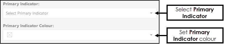
- Next, select the Colour drop-down to set a colour for your Primary Indicator.
Select from the Colour Selection area, to change the available colours select from the Colour Pallet on the right.
Alternatively, enter the RGB or Hex code directly.
Select Ok.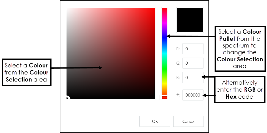
- Select Add
 to open the Segment Indicator options.
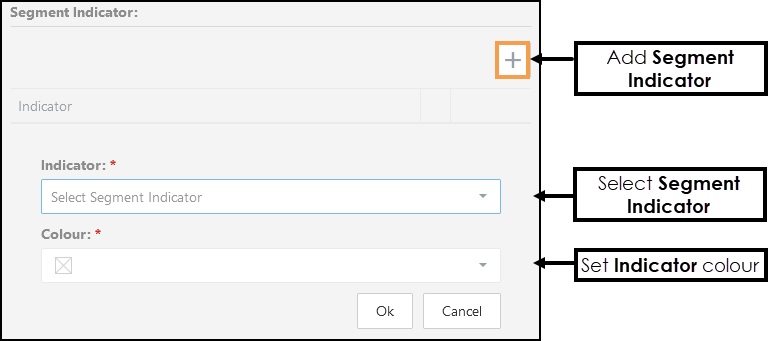
- Select the Segment Indicator from the drop-down list.
Using the example of SMS Consent Status, and the Primary Indicator is Active Patients aged 16 and over, Segment Indicators can include patients aged 16 over SMS Consent and patients aged 16 over SMS Dissent. - Set a Colour for your Segment Indicator.
- Add further Segment Indicators as required.
- Select OK to save the Segment Indicators.
- Set the Chart Options as required:
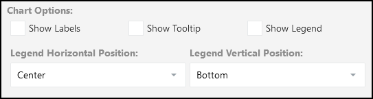
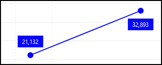
Chart Options Description Show Labels Select to display the actual values on your chart:
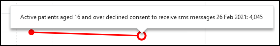
Show Tooltip Select to enable Tooltips when hovering over your chart, this includes the indicator, date and value:
Show Legend Select to display the Indicator details underneath the chart:
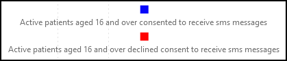 Note - You may need to resize the Widget to see the Legend.
Legend Position Optionally, you can define the Legend Position.
Legend Horizontal Position - select from: Centre, Left or Right.
Legend Vertical Position - select from: Bottom or Top.
- Optionally, set the Report Date Grouping, this defines how many date ranges are represented in one view.
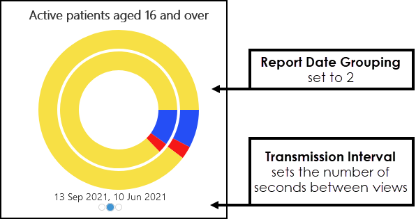
- If the Date Range covers more than one extract the Pie Chart displays as a slide show.
To set the Transmission Interval, drag the bar to set the number of seconds between views. - Select Done to save and X to close the Properties.
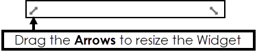
The Widget displays. - Hover over the Widget to activate the Arrows, these can be used to resize the chart.